The success and popularity of a manga depend heavily on the drawings and artistic style of the mangaka. Therefore, it is not strange that specific panels go on to receive praise.
These are valued as works of art in and of themselves and within the fandoms.
If you read manga, you must frequently encounter scenes that make an enduring impression on you.
In this article, you’ll discover the most exquisite manga panels. I ranked them based on the scene’s effect, artwork, and impact.
Most of them come from my favourite manga, but I also selected others from the internet based on my preferences.
So let’s cut to the chase and enjoy these 50+ Beautiful Manga Panels that are visually stunning.
1.) Slam Dunk
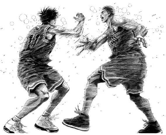
Possibly Slam Dunk’s most recognizable panel is this one. Sakuragi and Rukawa’s high five after the championship game is seen here.
They showed this moment of unity despite their long history of hatred.
Takehiko Inoue employed action lines to depict the fluidity of motion in this panel. To convey the feeling of the scenario, he additionally darkened them. This abstraction decided the drawing’s atmosphere and composition.
2.) Assassination Classroom
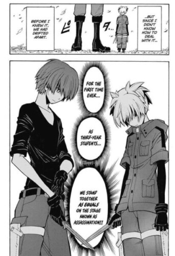
Karma and Nagisa are prepared to engage in combat in this panel. Despite being great friends, they have very different personalities. Nagisa is calm and composed, unlike Karma’s self-assured and playful youth.
As we can tell from the author’s painting, there is a lot of tension between them. What will the outcome be?
3.) Berserk
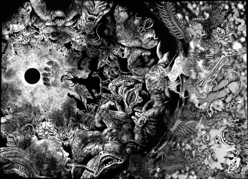
This panel is either amazingly lovely or utterly horrific. It’s hard to tell. Or perhaps both. Everything is exceptionally well drawn, with meticulous attention to detail, from God’s Hand in sharp focus with the eclipse to the nightmare apostles.
The fact that Guts remembers the entire incident as if it happened yesterday is a hint.
This panel is a beautiful illustration of Miura’s artistic talent. He had the option to draw it as usual. Instead, he decided to go all out in capturing how horrifying Guts finds the recollection of the eclipse.
4.) Monster
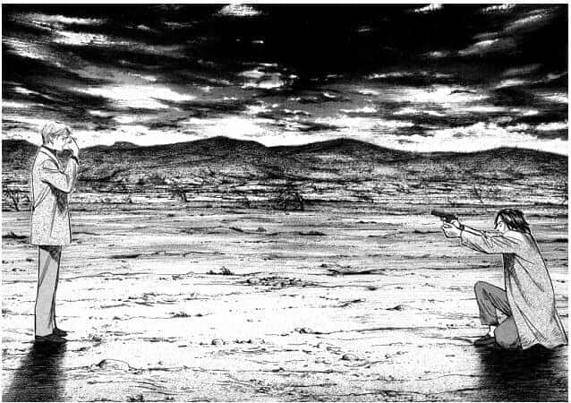
This manga panel depicts Tenma Kenzo and Johan’s ultimate confrontation. Look at how Naoki Urasawa uses shadow and shading to give this scene depth.
The graphite in the mountains would reflect light when viewed up close, giving them delicate outlines.
This mimics the vegetation and scenery found in actual mountain ranges.
5.) My Hero Academia
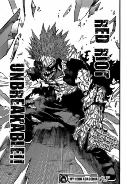
Since I am a fan of Kirishima, I had to include this panel in the list. When I first saw this, I was pretty proud of my baby. With the help of his closest friend’s encouragement, he was able to face his anxieties and conquer his fears.
He was also able to gather his bravery and resolve. He has finally become strong enough to stand up to his adversaries and defend the people who are important to him.
6.) Attack on Titan

The viewers are constantly in awe of how marvellously Hajime Isayama’s artwork has changed over time. He has continuously raised his game and produced iconic manga panels for us. Anyone who has read the AOT manga will attest to how scary this panel is.
First, Eren’s immense size is alarming since it makes the vast gap between his titan and the other massive titan’s crystal evident.
Second, it appears similar to the opening scene, where the enormous titan observes Eren and the other Shiganshina citizens. They had nowhere to flee that day and were filled with terror, helplessness, and despair.
7.) Oyasumi Punpun
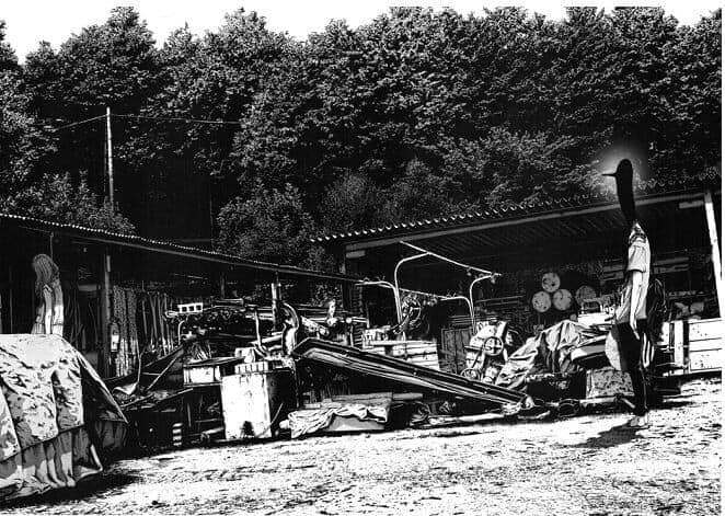
The manga Oyasumi Punpun is a coming-of-age story. Some of the most beautiful manga panels I have ever seen, although it is a very depressing read. For instance, consider this scene.
It appears to be an image rather than a drawing because of the attention to detail on the trees and shed.
8.) Oyasumi Punpun (Panel 2)
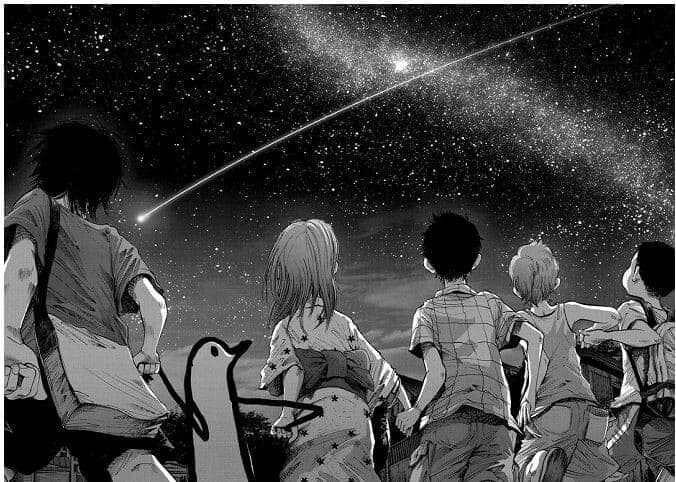
Also worth mentioning is this manga page of a starry night. In contrast to the generally sombre themes of Oyasumi Punpun, this panel exudes delight and surprise.
The use of light and shadow is stunning. The illustration makes sense in colour.
9.) Tokyo Ghoul
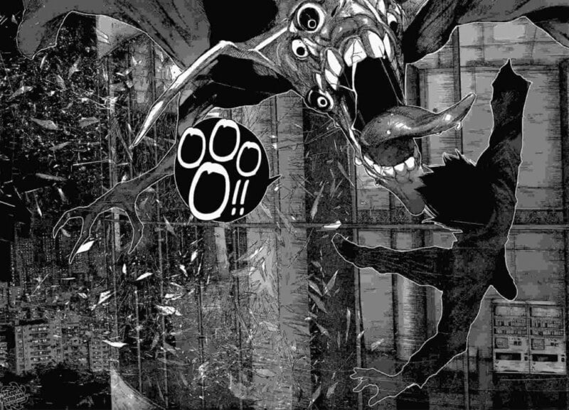
Excellent artistic abilities belong to Ishida! The entire Tokyo Ghoul manga is filled with fantastic and captivating pages that may draw readers in. This is just one illustration. The broken glass in the backdrop is the reason I chose it.
The building’s windows were broken into tiny, uneven fragments during the battle. Before they fall to the ground, they are suspended in midair, and each piece distinctively reflects the city’s illumination.
Relevant: 10 Types of Anime Drawing Styles That Artists Should Know About!
10.) Naruto
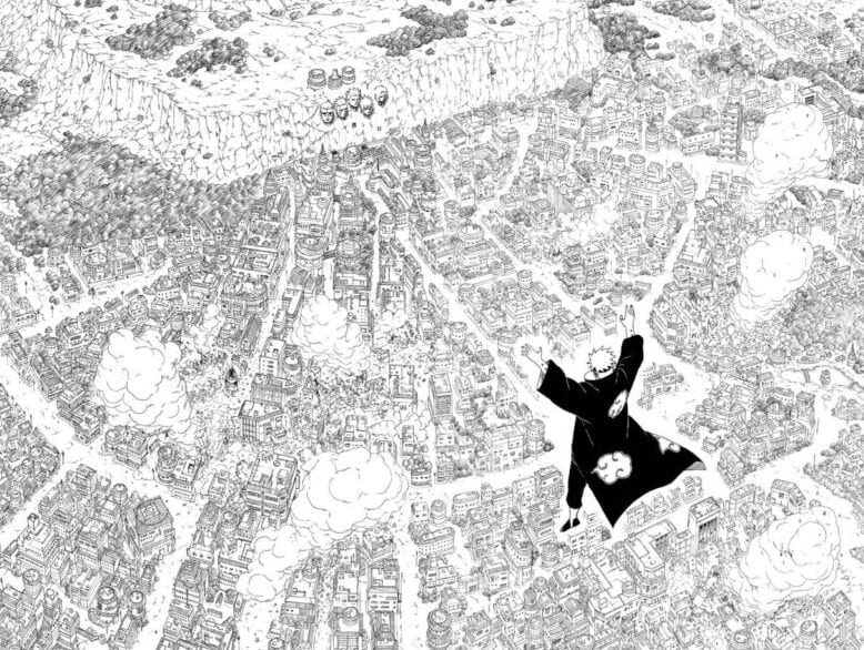
No fan of Naruto, whether anime or manga fans, can get this picture out of their head. It is merely majestic and gives you the sensation that disaster is imminent.
This image fits perfectly with Pain’s godlike persona, as he perceives himself as superior to everyone and as having the power to judge the world.
The structure of the Konoha town, which is beautifully designed and masterfully laid out, is what impresses me about this panel. But despite how lovely everything is, it also makes you anxious about what will happen.
11.) Otoyomegatari
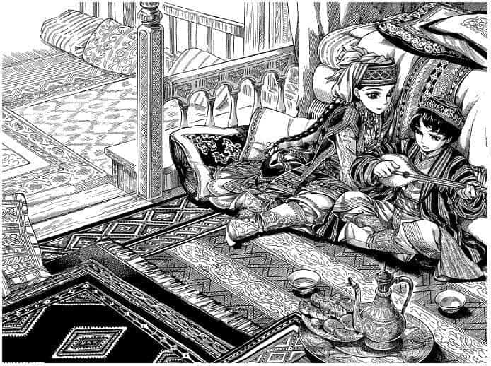
One of the most significant historical romance mangas ever produced is Otoyomegatari. But its narrative isn’t the only aspect that sets it apart. The manga art by Kaoru Mori is of the finest quality.
Every panel contains such fine detail that every scenario is breathtaking. This is best seen in the picture up top. It is a favourite that has won awards because of its clean lines, patterns, and intricate details.
12.) Yona of the Dawn
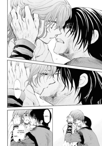
Since the first manga page, I have supported these two and have been anticipating this day for so long! Slow-burn romances are something I detest, but I always force myself to read them.
By the way, Hak and Yona finally expressed their love for one another and are now a couple! The evolution of their connection is something I’m interested in seeing.
13.) Vagabond
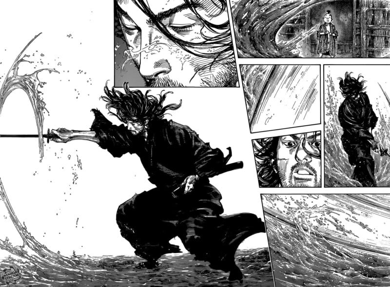
Everything in this panel is impressive, from Musashi’s graceful posture to Inoue’s persistent attention to detail while embellishing the water.
In stark contrast to the manga’s often frenetic situations, this image conveys a sense of happiness and peace. Here, Musashi trains quietly in the water before alerting Iori to his hunger.
You can’t help but be calmed by the sight and admire its quiet beauty.
14.) Berserk
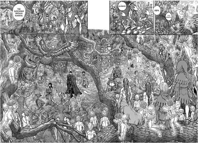
Which characters can you identify in this panel? Fifty? Make a guess now. No. This panel contains 147 characters. Unimaginable thought and outlining went into this single scene by Miura.
The composition deserves special praise. You’ll notice that the key characters command your attention right away among the 147 other characters. The fairies, the branches, and each other form a framework.
One of the most thought-provoking panels ever created.
15.) Eden’s Zero
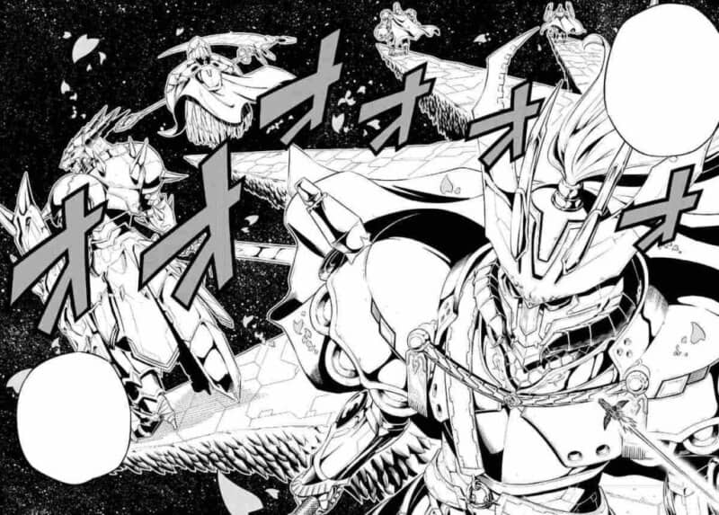
The latest creation of Mashima, following Fairy Tail, is Eden’s Zero. Mashima has always had excellent drawing abilities, in my opinion, but in this comic, he truly outdoes himself. Twelve mythical heroes known as the Heavenly Knights of the Dancing Sakura are shown on this panel.
Not the knights in the foreground but the starry background and the soaring sakura petals, which stand in for the Sakura Cosmos, are what I find appealing about this illustration.
16.) One Piece
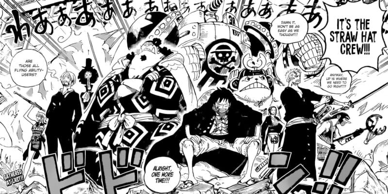
Something unexplainable happens when you see the Straw Hats all united in one panel. It’s filled with pride, joy, excitement, and thrills.
Our favourite characters are posing in the most aggressive manner imaginable in this picture, which looks fantastic. The fact that they have all gathered to confront the enemy for the first time in a long time makes it meaningful.
The team is invincible, even if each member is competent. You get that sort of impression from this manga panel.
17.) Jagaaan
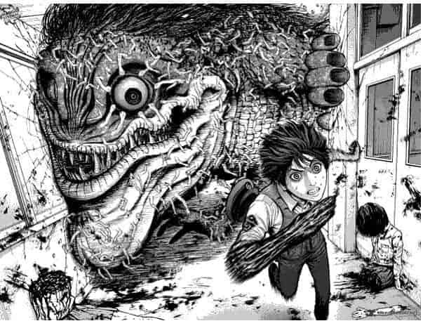
A monster destroys the school in this scene. In the process, he destroys passageways; you can observe the action on the left side of the page. It seems like the walls are opening up to make room for him.
The creature’s anatomy looks realistic, and the transitions between the black and grey colours are flawless. It’s fascinating to note that while Jagasaki has monster hands, the monster has human hands.
The panel becomes more intricate as a result.
18.) Tokyo Ghoul

A creature is seen tearing through the school in this picture. You can observe the movement on the left side of the page as he tears halls apart. The walls seem to be opening up to make room for him.
The transitions between the black and grey are flawless, and the monster’s anatomy is realistic.
Intriguingly, Jagasaki has monster hands, while the monster has human hands. The panel’s complexity is increased as a result.
Relevant: 30+ Of The Best Anime Scenes That Are Unforgettable
19.) One Punch Man
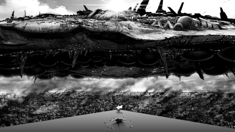
The remarkable collaboration between ONE’s writing and Yusuke Murata’s art in One-Punch Man is impossible to express in words. You really want to ask Murata, “How did you even draw that?” after looking at this comic panel.”
Saitama is standing in front of the spaceship as if it were his enemy, allowing you to see how small he looks in comparison.
The ship’s structure, the city, and the smoke below are intricately designed, giving off a terrifying three-dimensional appearance.
20.) One Punch Man
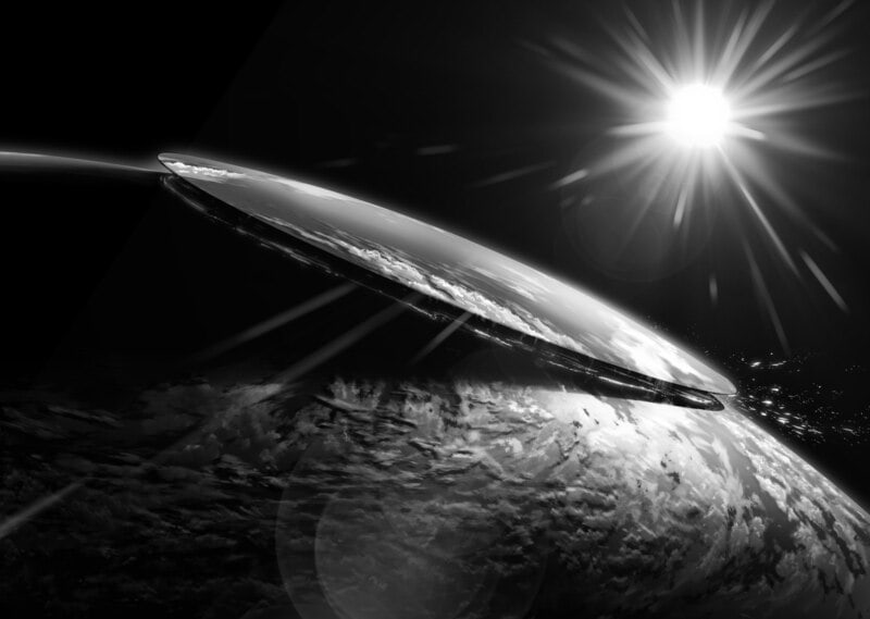
This illustration of Psykos’ assault tearing the vast oceanic crust in two is insane. Given the size of the assault, it is impossible to determine that it is taking place in Japan.
That is absurd, but this panel’s artwork is breathtaking. Just look at the incredibly accurate illustration of the Earth and the sunlight bouncing off it.
It demonstrates Murata’s comprehensive knowledge of how to use light and reflection and his general artistic intelligence.
21.) Gantz
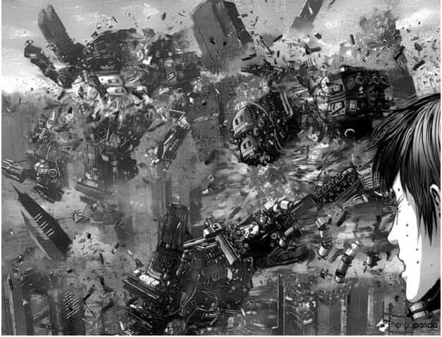
Gantz is an absolute gold mine of exquisite artwork. This panel, in particular, has a fantastic sense of dimension. You are watching someone as they observe the city being destroyed by robots.
You might mistake it for a scene from a motion picture because of how intricate it is.
22.) Jujutsu Kaisen
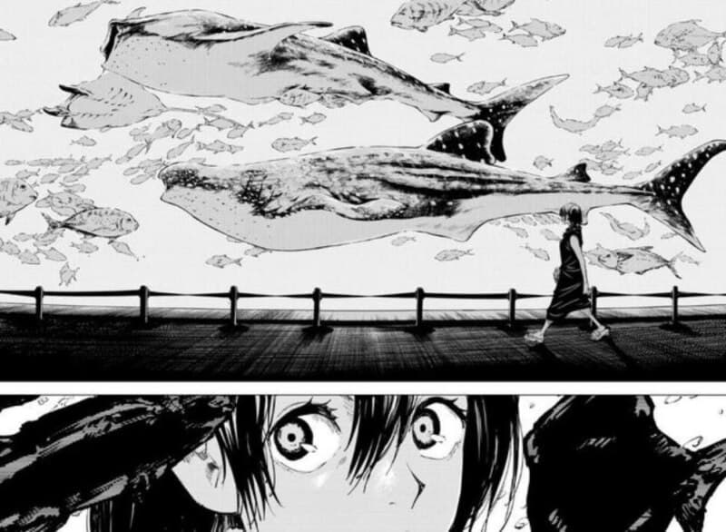
Riko is a character that only appears in flashbacks, although she plays an important role. She is a typical shojo manga girl in this panel, going to the aquarium with her classmates while on a field trip to Okinawa.
Her gaze is fixed on the window behind which calmly swimming fish and whales can be seen. She was a typical teenager in every way, but destiny had other plans for her.
23.) Bleach

The artwork of Tite Kubo has long been appreciated. One need only look at Bleach to be persuaded to read the manga; everything is so aesthetically attractive, from the background in the panels to the character designs. Ichigo is an ordinary schoolboy, despite what you might think.
Well, not really, and if you look at this panel, it is much more incredible. One of the most talked-about moments in anime and manga is this scene from Bleach.
Kubo’s artwork is outstanding, as always, and the panel’s dominant jet-black ink emphasizes the majesty of this shape. Also remarkable is Ichigo’s apparent calmness.
24.) Inuyashiki
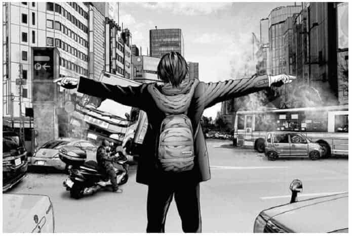
The same mangaka that developed Gantz, Hiyora Oku, also produced Inuyashiki. This panel shows how he uses cleaner methods to depict chaos and dimension. His choice of greys representing the city and smoke draws attention to Inuyashiki’s all-black coat.
The scene’s brilliance is enhanced by how uncomplicated it appears to be. Hitora Oku demonstrates that he can evoke fear in us without using robots in his illustrations.
It’s enough to get the main character into a fantastic vehicle accident.
Relevant: 26+ Of The Best Seinen Anime That Are Too Good To Ignore
25.) Food Wars
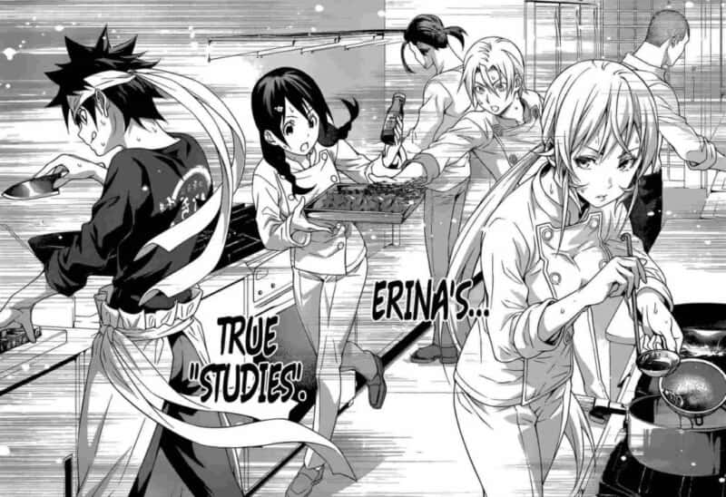
The straightforward art in this comic is fantastic. This panel, which features four of the most notable characters, is an excellent representation of the entire series. They are all concentrating in the kitchen and attempting to assist one another.
Another essential component of Food Wars is its emphasis on friendship.
26.) Vinland Saga
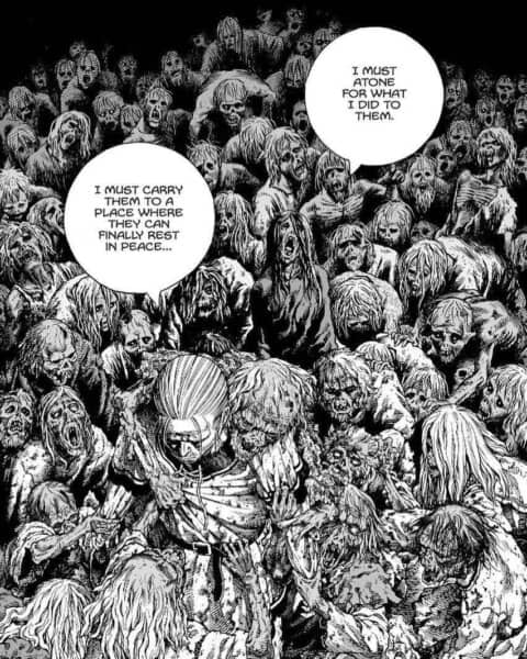
Makoto Yukimura is a superb manga artist and writer. His artwork is eerily stunning, and his writing is god-tier. This manga panel’s artwork will undoubtedly leave you dumbfounded.
With all of its intricate elements that perfectly complement the passionate monologue, it is gloomy, grim, and unsettling.
The main idea of the Vinland Saga is perfectly illustrated in this panel. It serves as a powerful metaphor for Thorfinn’s wrongdoings the victims he has murdered—and how they have all led him down a dark path he has paved.
27.) Kokou no Hito
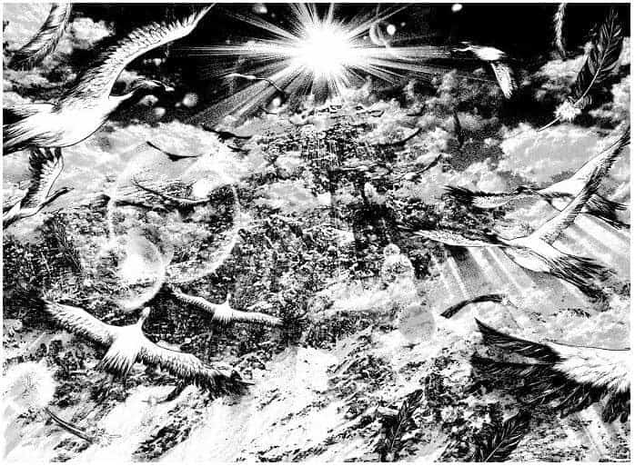
Shin-ichi Sakamoto is renowned for using black and white on purpose in his panels.
This one is stunning since it gives you the impression of soaring into the sun alongside the birds. The lines are clean, and you can see the shadows cast as the birds shift to face the sun.
28.) The Promised Neverland
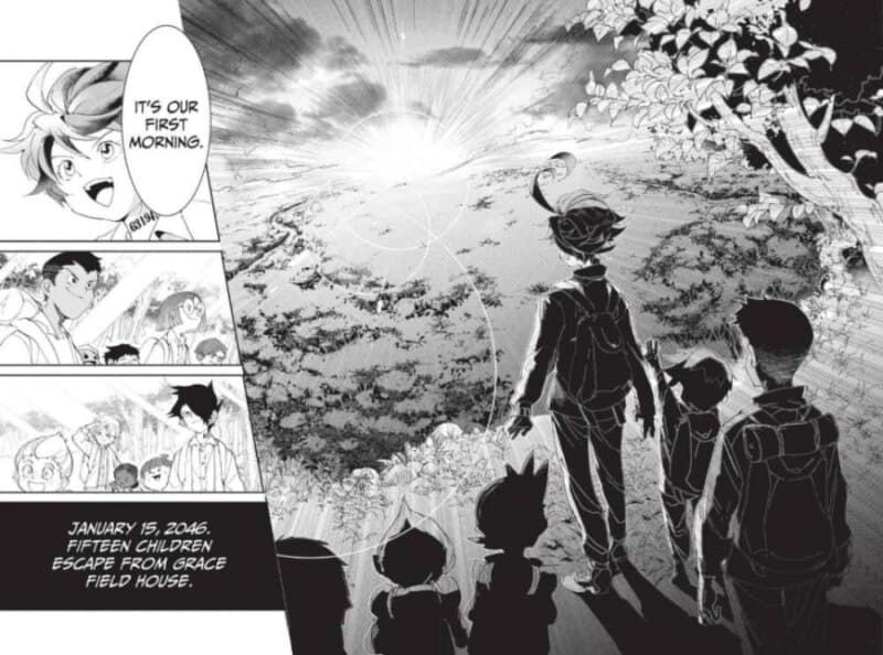
Ah, freedom’s lovely flavor. It is now finally available for Emma and the others to taste. The children in this panel have successfully left the orphanage and are now prepared to face the future.
In this highly symbolic scene, the children are looking toward the sun, which is beginning to appear on the skyline.
They have their backs on the readers and cast a dark shadow, indicating that they are prepared to move on from their troubled past and toward the dawn and a fresh start.
29.) Hunter x Hunter
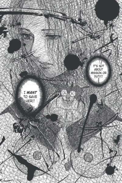
Yoshihiro Togashi has repeatedly shown how talented he is through his outstanding storyline and stunning artwork. Nothing less is to be expected from a manga artist who has continuously honed his craft since he was a young child.
The beauty of this manga panel is in how mesmerizing it becomes as you stare at it more and more. Just consider how much time and work must have been put into drawing it.
The excellent scribbling design merits praise because this scene didn’t require such exceptional artwork.
30.) Innocent Rouge

Manga artist Sakamoto Shinichi uses dreamlike scenes to depict Marie Antoinette as she enters her thoughts. For instance, this panel has an ethereal quality. It is gorgeous, romantic, and intricate.
The fact that this runs against the manga’s overarching concept, though, makes it stand out.
Innocent Rouge examines brutal deaths and torturous torture. Marie Antoinette’s peaceful demeanour adds drama to her passing.
31.) D. Gray-Man
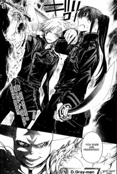
Do you sense any power coming from this panel? Isn’t it awesome? We know that Allen and Kanda are rivals, allies, and influential individuals. But what would happen if they joined forces?
Well, their enemy will see it firsthand.
32.) Demon Slayer: Kimetsu no Yaiba

Koyoharu Gotouge is a master at fusing a compelling narrative with equally stunning visuals. Both the manga and the anime versions of Demon Slayer have a distinctive, gorgeous, and attractive art style. It isn’t easy to look away from this panel since it is so lovely and intriguing.
Tanjiro’s astonishingly quick movements, his Hinokami Kagura, and his dashing at Daki through her belts with a frighteningly intent expression created various images of him.
The anime elevated this panel’s stunning appearance even more.
33.) Hideout
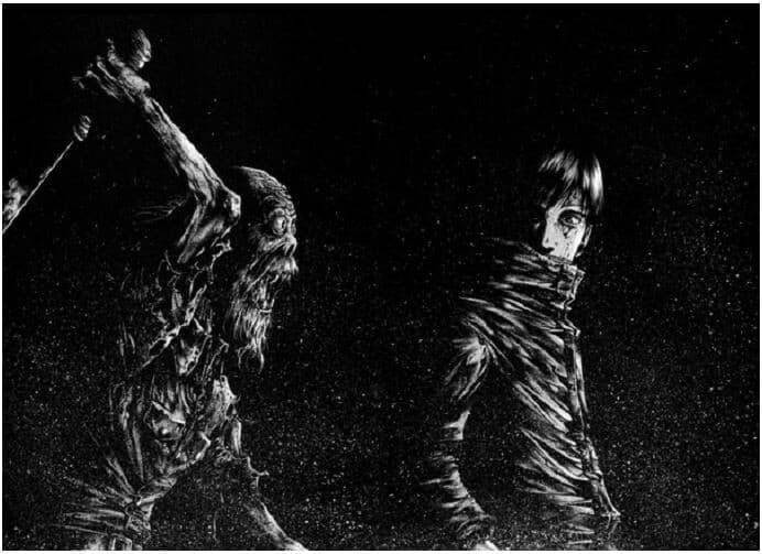
A horror manga that more than lives up to expectations is called Hideout. Even just this panel is frightening. This flesh-eating monster is poised to attack Kirishima, but he’s looking at you instead.
That conveys information about how danger increases.
Masasumi Kazuki’s masterful use of darkness in this sequence is ideal for the story. Just as horror art should, the panel has an impact on you.
Related: 31+ Wholesome MANGA Series That Will Put You At Ease
34.) Katekyo Hitman Reborn
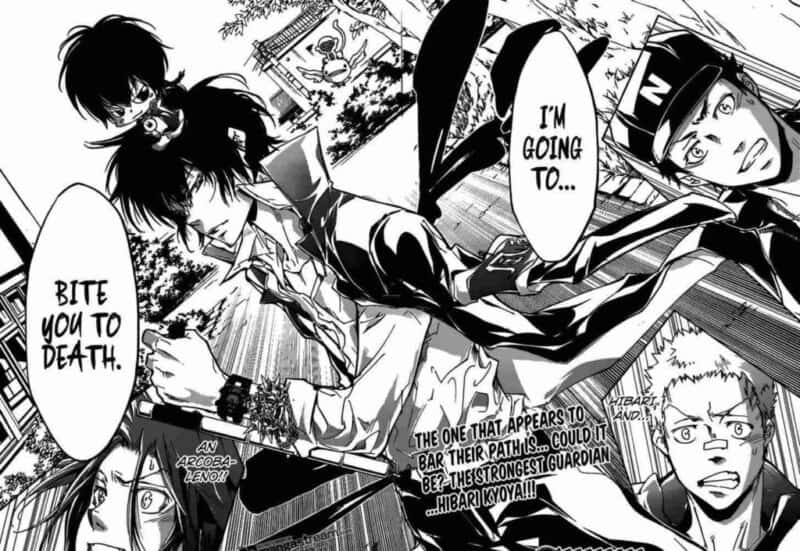
One of the most extraordinary characters I know is Hibari. Though challenging to manage and with an eccentric demeanor, he is a strong and devoted man.
He is the most well-liked character in the series because of this. However, Hibari appears in this panel to “bite to death” the Reborn team members.
He doesn’t care that he is a guardian like Gokudera and the others since he wants to fight them to show that he is more powerful than them. He cracks me up!
35.) Akira
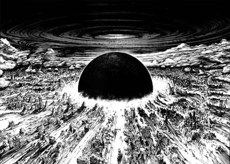
A fun fact about this magnificent manga panel is that Katsuhiro Otomo spent an entire evening drawing thin black lines to illustrate the volume of the enormous sphere in focus and to depict the gravity of this scene, with the number of people dying inside.
This panel alone is proof that Otomo is a truly unique artist.
Not only that, but the panel as a whole has incredibly complex shading and crosshatching. Because of this, it seems even more terrifying and genuine. It is certainly deserving of all the buzz.
36.) My Hero Academia
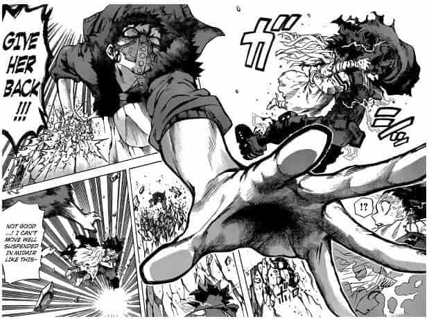
Fans of MHA will attest that this scene merits a spot on the list. It’s clever of Overhaul to cross his palm over the panels as Midoriya retreats. It has the best three-dimensionality possible.
Add to that the fact that this conflict had high stakes and was tense. These components come together to make a top-notch manga panel.
37.) The Seven Deadly Sins
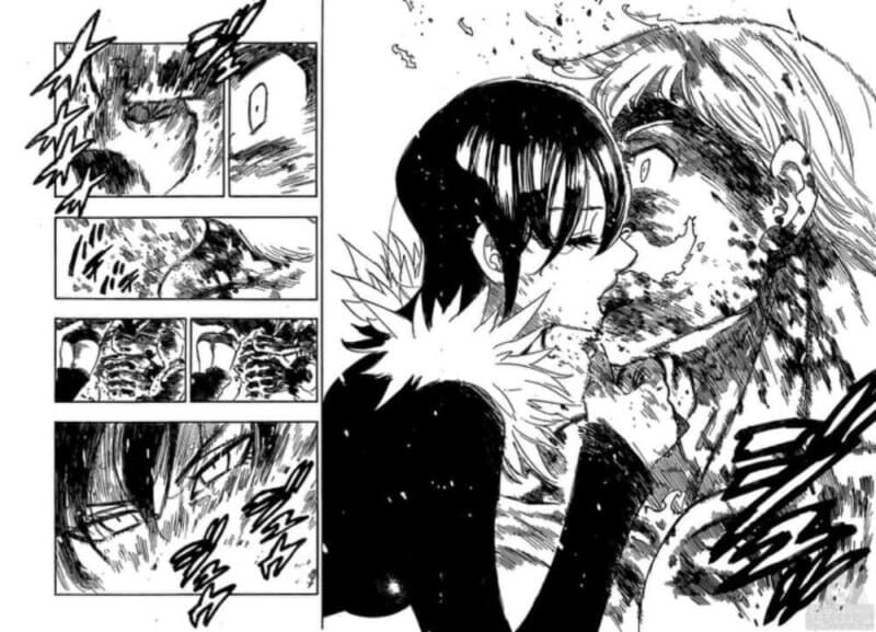
This situation is tragic. Escanor did his best to fight alongside his friends, but he overstepped his bounds and set his own body on fire. Even though he is aware that he will pass away, he persists.
He says goodbye to his buddies and, finally, opens out to Merlin about his thoughts. She still kisses him even though she doesn’t return his affection, telling him that the burns on her body constantly remind her of the one guy who loved her.
38.) Jojo’s Bizarre Adventure
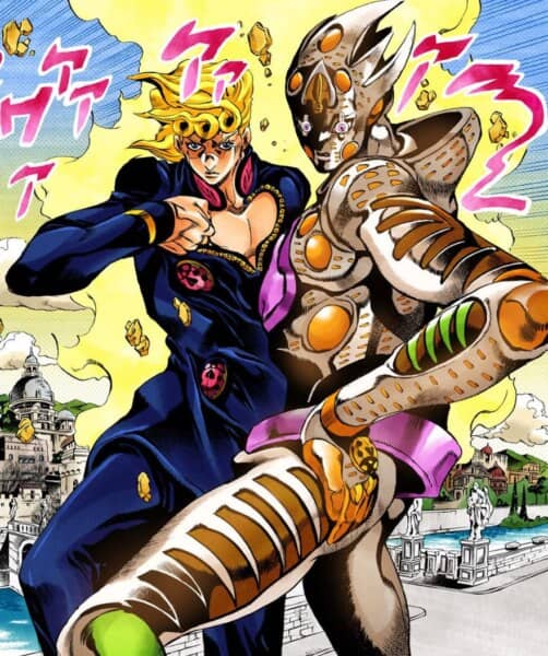
With his manga panels, Hirohiko Araki never fails. They always have a clear structure and can build irrational anticipation for each new chapter. His work has always been distinctive and has only become more accomplished.
Without a JoJo posture, this list would be lacking, so what better option than Giorno’s well-known GER pose. At that point, our pal Diavolo realized he was lost. Even putting away the countless JoJo posture memes, this picture is undeniably awesome.
This panel, which was already famous to fans of Jojo, was excellently handled by the anime.
39.) My Hero Academia
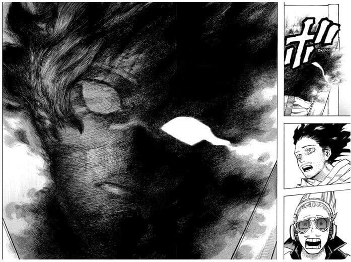
This one from chapter 255 was terrifying, though. Kurogiri and Shirakumo appeared to share a body, and Shirakumo struggled internally. Horikoshi’s ability to emote with such intensity through the sketchy technique and eyes is astounding.
40.) Gintama
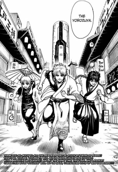
When I first saw it, I bawled my eyes out. The Gintama manga’s final page is this one. This series is thrilling. It begins like a comedy manga, but as you read on, you become emotionally invested in each character and their relationships.
They merge into your being. Yorozuya is my adopted family. It is, therefore, overwhelming to see Shinpachi, Kagura, and Gin-chan running in our direction at the manga’s conclusion.
41.) Jujutsu Kaisen
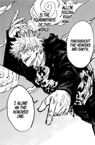
Gege Akutami is an artist with a distinctive style who excels at creating spine-tingling panels. This panel is so beautiful to look at, like the cover of a magazine or something, that it will take the internet by storm when it is animated.
Here, Gojo is essentially declaring that he is the strongest person in the universe, and you can’t help but notice the unique look of excitement on his face—you rarely see him that ecstatic during a battle.
He finds it to be relatively easy most of the time. Here, he is sincerely engrossed in the excitement of combat with the one and only Toji, displaying his true nature.
42.) Bakemonogatari
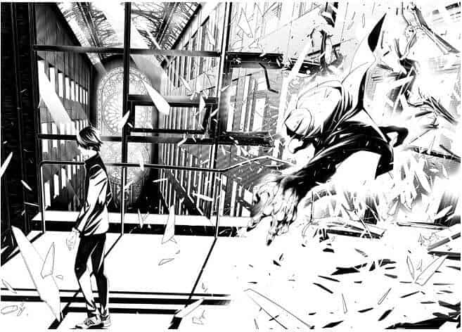
With this, Ogure Ito outdid himself. The glass broke, and the pieces are now reflecting the light. The movement’s smoothness is quite expressive.
Even as the monster appears behind him, Koyomi is unbothered. The panel will have a straightforward yet complementary contrast if you split it in half.
43.) Tsubasa Reservoir Chronicle
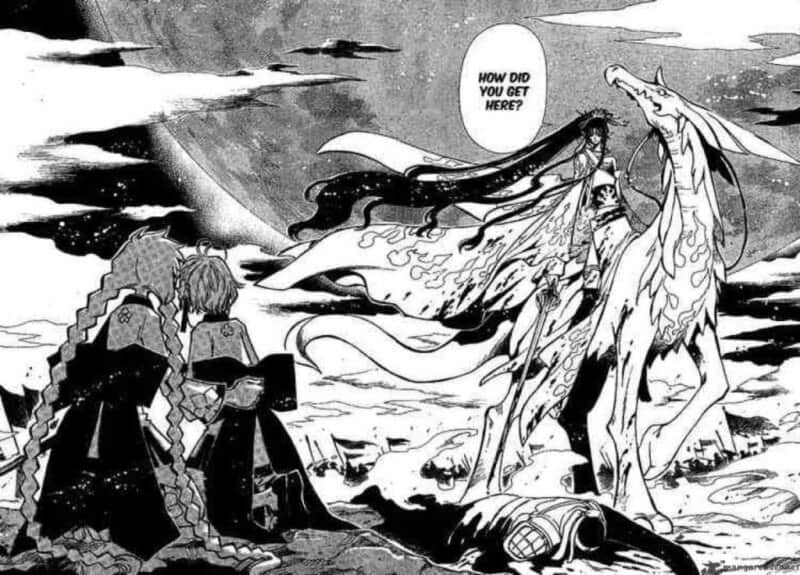
Shaoran (the one with the braids) and Sakura become separated from their pals and find themselves in an unfamiliar realm while searching for the girl’s feathers.
The King Ashura, a cross-over character from an earlier book, is the person who is standing in front of them on the winged beast. This scene is breathtaking and wonderfully captures the eerie, fantastical mood for which this series is known!
44.) Chainsaw Man
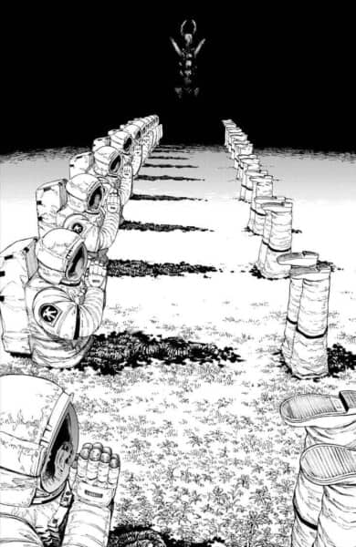
Tatsuki Fujimoto has made a name for himself as one of the greatest mangakas of this generation, thanks to his outrageously horrifying artwork. Yes, this is the panel that received a ton of online attention.
Simple phobias are represented by the Darkness Devil, who is seen praying behind a group of deceased astronauts.
We are afraid of the “unknown” in the darkness, and these astronauts who entered the abyss met a tragic end. It illustrates the foolishness of those who carelessly enter the uncharted territory without knowing what horrors may be waiting there.
45.) Remina
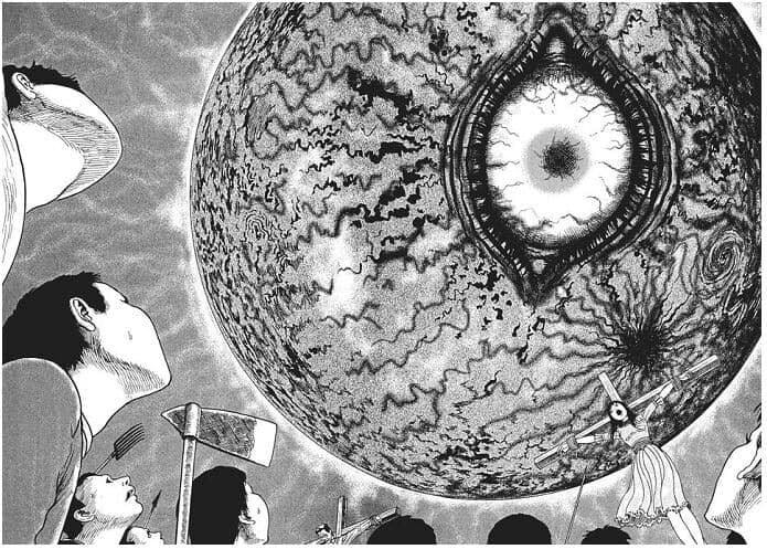
This panel demonstrates the mastery of terror that Junji Ito possesses. Your eyes will naturally gravitate toward the huge eye at first glimpse. Your gaze suddenly descends, and you catch sight of the girl atop a cross.
Interestingly, this tiny internet element changes the scene’s tone.
The enormous eye can be seen in any shounen manga, but the female is a unique touch. It gets much more terrifying all of a sudden.
46.) Haikyuu!!
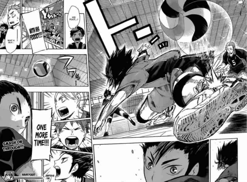
I love Nishinoya so much! I adore the panel when he successfully uses his foot to capture the ball. He really is Diety, the Guardian of Karasuno! I want to pay attention to the artwork rather than the coolness of the scene.
Nishinoya’s sneaker has insanely delicate detailing! Particularly the sole, which appears very authentic.
I like how the author depicted the ball’s bounce movement using a void round form to represent the ball’s trajectory and a visual impact when it strikes the shoes.
47.) Assassination Classroom
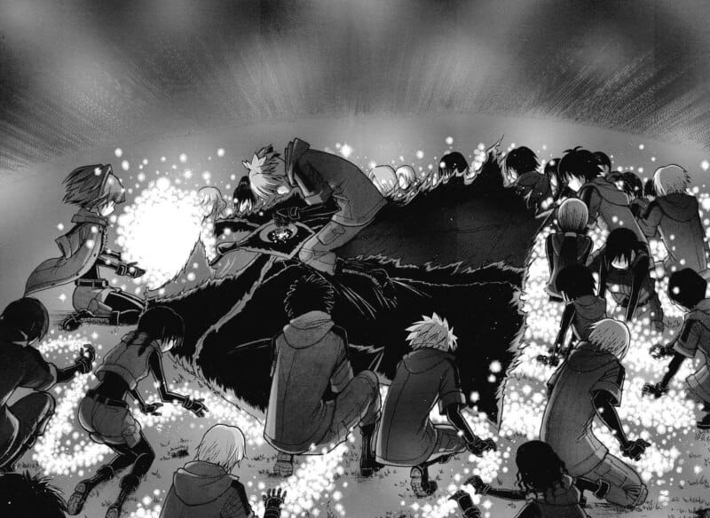
It’s painful to see the students of Koro Sensei gathered around his body in this manga panel as he passes away. Spots of light in complete darkness make it look beautiful, but the moment itself has great significance.
It is enough to make you cry your eyes out when you realize that Koro-sensei, a character we have grown to adore, is departing his students, the school, and this planet forever.
48.) Asteroid

The artwork of the manga Astroid is quite diverse. One of its milder, more streamlined moments comes in this panel.
The swirls make an optical illusion. This gives the galaxy, the planet, and the ground a fractured appearance. The usage of black and white with little grey is distinctive and contributes to the cartoonish appearance.
49.) Alice in Borderland
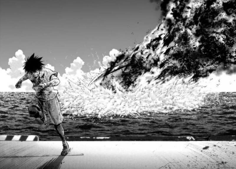
This panel is genuinely excellent. The author depicted this moment very well. It is a dramatic scene in which the boy desperately runs away, and something falls into the sea.
The details of the sea waves are perfect, even when the flying object hits the surface of the water, generating a splash and sea foam. Also, the smoke’s black and white contrast feels very real.
50.) Black Clover
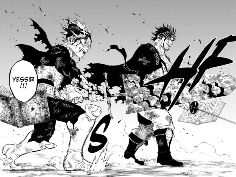
One of this generation’s most popular shonen manga is Black Clover by Yuki Tabata. The manga’s artwork is generally good, but during fight scenes, it improves significantly to match the thrill of those events.
I don’t know what will make you jump out of your chair like this manga panel did. The definition of hype is this scene. It’s thrilling to see Asta and Yami, the manga’s two main protagonists, fighting alongside one another while appearing ecstatic and pumped up for the battle.
The artwork is so clean and clear that it would be suitable as an anime poster.
51.) Gigantomakhia
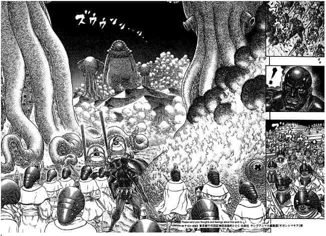
Berserk’s Kentaro Miura wrote the sci-fi novel Gigantomakhia. As you can expect, the panels are equally impressive. Similar drawing methods are used by him but on larger scales. Because of this, fans claim that Gigantomakhia was explicitly designed for Miura to exercise his artistic muscles.
The commencement of the tribal conflicts is depicted in the panel. Ogun’s horror-filled expression underlines the perspective we are given, and the world-building is magnificent. This viewpoint makes the threat posed by the Empire tangible.
–
Recommended Next:
29+ Of The Best Manga Without An Anime Adaptation
25+ BEST Upcoming Manga Released (Or Ongoing) in 2023!

